
A quick internet search of “Create a Custom Gutenberg” block will show the web is stuffed full of these tutorials.
So we’ll try to do this with a little flourish. Let’s build a roughed-out, non-trivial WooCommerce based block that shows a customer the info of their most recent order on the front end.
The resulting project can be quite interesting So interesting, that I had to build a multi-directional lesson to get all the info. Left/Right still move you through the main topic–But Up/Down will let you go in-depth on specific topics. Mash the ESC button to get a map of the slide deck. and informative.

cd into directory
npm startLaunches a watch task that will build your JS, CSS, and PHP files whenever you save a change
In wp-config.php
define(‘SCRIPT_DEBUG’, true);Gives descriptive error messages in your browser console.
Here we find ourselves in a bit of a moral quandary: The npx package builds a structure that is quite different from the construction of existing WooCommerce blocks:
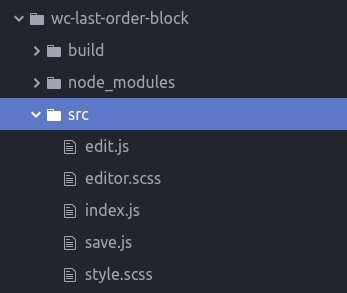

The npx build creates a structureDig deeper and you’ll see this structure is very functional with the main interplay between the index.js, edit.js and save.js files
WooCommerce Gutenberg blocks hold the main interaction By expressly describing and using the React Component, the resulting structure is more Object Oriented between index.js and block.js
With two competing patterns from authoritative sources, we need to make a decision. We’ll go with the WooCommerce Pattern. While unique to our specialty, this pattern is also a bit clearer on what, exactly, is going on–and therefore a bit more informative Steps include:
- Create a block.js file in the src directory to hold your React Component.
- Import the block into the index.js file
- Change the ‘edit’ method of registerBlockType to return your block.
- Change the ‘save’ method to a function.
- Delete the save.js and edit.js folders
- Update the specifics in registerBlockType
block.js is where we are going to build our react component.
At first we’ll start with just the bare minimum imports and placeholder methods for clarity.
Be sure to export your blockThis goes high on the list of “silly things we often forget”, so it’s available to index.js
/*Bare minimums with placeholder functions*/<
import { Component } from '@wordpress/element';
class WCOrderLatest extends Component{

    getInspectorControls(){
    //This is where your block settings will appear
    }

    render(){
    //This is where your in editor block appearance is determined
    }
}
export default WCOrderLatest;In the top of index.js, delete the imports from save.js and edit.js
import Block from './block';

import './editor.scss';
/**
* Internal dependencies
*/
import Edit from './edit';
import save from './save';Add imports from your block file and import your editor.scss, so that webpack will process it in the build.
The edit method should call your React Block component, it receives the props argument.
The save method will return your desired front-end HTMLIn JSX form.; it receives the attributes argument.
edit: function( props ) {
	return <Block { ...props } />;
}
save: function( {attributes} ) {
//We're going to return the front-end HTML here
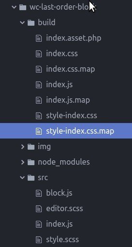
}Resulting file structure
Your edit.js and save.js files are no longer used, Delete them.
For this example, I'm also going to add a img/beanie.jpg asset Stolen Borrowed from WooCommerce to serve as our placeholder product image.
The resulting file structure shown to the left.

index.js Housekeeping
For some final housekeeping we'll adjust the title, description, attributes, category, and icon props in the registerBlockType config object.
	title: __( 'WC Last Order', 'wc-last-order-block' ),

	description: __(
		'Display Status of Customer\'s last order',
		'wc-last-order-block'
	),
	attributes:{
		title:{
			type:'boolean',
			default: true
		},
		image:{
			type:'boolean',
			default: true
		},
		orderStatus: {
			type:'boolean',
			default: true
		},
		orderDate: {
			type:'boolean',
			default: true
		}
	},
	category: 'widgets',
icon: 'archive',getInspectorControls method (step 1)
import { Component, Fragment } from '@wordpress/element';
import { Disabled, PanelBody, ToggleControl } from '@wordpress/components';
import { InspectorControls } from '@wordpress/block-editor';
import { TextareaControl } from '@wordpress/components';

import { __ } from '@wordpress/i18n';
There's a series of components we'll use from the WordPress packages to build our Block's control panel.
| Component | Use |
|---|---|
| InspectorControls | Outermost wrapper element of the Control Panel |
| PanelBody | Subsections within the panel |
| Fragment | Wrapper element to help meet JSX requirements without garbling HTML. |
| ToggleControl | Toggle elements for True/False Attributes |
| __ | The translation function you know and love |
| TextareaControl | I bet you can guess what this is  |
| Disabled | Block interactions for a section, used in the render method |
getInspectorControls method (step 2)
const { attributes, setAttributes } = this.props;
At the start of our getInspectorControls method, we'll destructure the attributes object, and setAttributes method from this.props.
For further simplicity, we'll destructure individual attributes..
const { title, image, orderStatus, orderDate, backup }= attributes;getInspectorControls method (step 3)
Finally, we'll describe each of our elements. Details for each of these can be found in the Codex Gutenberg component reference
Most of these are self explanatory--except for the onChange prop Shorthand: An arrow function , that returns the setAttributes helper function prop that takes a merged object literal argument. Take a close look to see how it works.
getInspectorControls(){
    const { attributes, setAttributes } = this.props;

    const { title, image, orderStatus, orderDate, backup }= attributes;

    return (
      <InspectorControls key="inspector">
        <PanelBody
          title={ __( 'Content', 'woocommerce' ) }
          initialOpen
        >
          <Fragment>
            <ToggleControl
              label={ __( 'Product title', 'woocommerce' ) }
              help={
                title
                  ? __(
                      'Product title is visible.',
                      'woo-gutenberg-products-block'
                    )
                  : __(
                      'Product title is hidden.',
                      'woo-gutenberg-products-block'
                    )
              }
              checked={ title }
              onChange={ () => setAttributes( { ...attributes, title: ! title } ) }
            />

            <ToggleControl
              label= { __('Product image from order', 'woocommerce') }
              help= { image ? __('Product image from order is visible', 'woocommerce')
                  : __('Product image image from order is hidden', 'woocommerce') }
              checked={image}
              onChange={ () => setAttributes({ ...attributes, image : !image}) }
              />

              <ToggleControl
                label= { __('Order Status', 'woocommerce') }
                help= { orderStatus ? __('Order Status is visible', 'woocommerce')
                    : __('Order Status is hidden', 'woocommerce') }
                checked={orderStatus}
                onChange={ () => setAttributes({ ...attributes, orderStatus : !orderStatus}) }
                />

              <ToggleControl
              label= { __('Order Date', 'woocommerce') }
              help= { orderDate ? __('Order Date is visible', 'woocommerce')
                  : __('Order Date is hidden', 'woocommerce') }
              checked={orderDate}
              onChange={ () => setAttributes({ ...attributes, orderDate : !orderDate}) }
              />

          </Fragment>
        </PanelBody>

        <PanelBody
          title={ __( 'Fallback', 'woocommerce' ) }
          initialOpen
        >
          <Fragment>
            <TextareaControl
              label="Fallback HTML"
              help="HTML you want to appear in this area if there is no Last Order"
              value={backup}
              onChange={ (html) => setAttributes( {...attributes, backup: html} )}
              />
            </Fragment>
          </PanelBody>
      </InspectorControls>);
}"helper" methods (optional)
To get really simple syntax in the render function, I built out some "helper" methods to return our placeholder data.
getLastProduct(attr){
        switch(attr){
          case 'name':
          return '{Product Name}';
          case 'image':
          return '/wordpress/wp-content/plugins/wc-last-order-block/img/beanie.jpg';
          case 'status':
          return 'Complete';
          case 'date':
          return '01/01/1970';
          default:
          return '';
        }
      }

    getHeading(){
        return(<div className="last-order title"><h3>Your last order with {this.getLastProduct('name')}</h3></div>);
      }

      getImage(){
        return(<div className="last-order image"><img src={this.getLastProduct('image')} /></div>);
      }

      getOrderStatus(){
        return(<div className="last-order status">Your order is {this.getLastProduct('status')}</div>)
      }

      getOrderDate(){
        return(<div className="last-order date">{this.getLastProduct('date')}</div>)
      }
Did you find the hack Hint: Look at the 'image' case in the getLastProduct method? Here's the fix:
render method
Now our render method is a simple series of conditionals, that checks out user-defined attributes and renders the control panel and the appropriate elements.
render(){
        const { attributes } = this.props;
        const { title, image, orderStatus, orderDate }= attributes;

        return (
    	<Fragment>
    		{ this.getInspectorControls() }
    		<Disabled>
            	<div className="last-order-box">
              		{title && this.getHeading()}
              		{image && this.getImage()}
              		{orderStatus && this.getOrderStatus()}
              		{orderDate && this.getOrderDate()}
            	</div>
    		</Disabled>
    	</Fragment>
    	);
}The Result

At this point, we can verify that our block behaves the way we expect it to in the editor. Add it to a page, toggle attributes, verify it saves and check the browser console for any errors.
The save method
Now that we've established our editor behavior, it's time to determine how our block will behave on the front end. We'll start with the save function in index.js
save: function( {attributes} ) {
	const { title, image, orderStatus, orderDate, backup }= attributes;
	return(
		<div className="wc-last-order-box">
       		<div className="last-order backup">{backup}</div>
			{title && <div className="last-order title"></div>}
			{image && <div className="last-order image"></div>}
			{orderStatus && <div className="last-order status"></div>}
			{orderDate && <div className="last-order date"></div>}
		</div>
	)
}
Once again, we'll destructure our attributes argument, and then conditionally return JSX for each attribute Just like our render method. We're going to leave the elements empty, and let our frontend JS script do the heavy lifting.
What about the Front End?
The PHP register_block_type function allows us to pass a 'script' value in our config array.
We'll use this script to render the elements in our front end block using localized data.
wp_register_script( 'create-block-wc-last-order-fe', plugins_url( 'front/last-order.js', __FILE__ ), array( 'jquery' ), '0.1' );

	register_block_type(
		'create-block/wc-last-order-block',
		array(
			'editor_script' => 'create-block-wc-last-order-block-block-editor',
			'editor_style'  => 'create-block-wc-last-order-block-block',
			'style'         => 'create-block-wc-last-order-block-block',
			'script'        => 'create-block-wc-last-order-fe',
		)
	);
Localized PHP data
add_action('wp_enqueue_scripts', function(){
		wp_localize_script('create-block-wc-last-order-fe', 'wcLastOrder', wc_last_order_block_get_wc_block_locals());
}, 90);

function wc_last_order_block_get_wc_block_locals() {
	$customer = wp_get_current_user();
	$bail     = array( 'last_order' => false );

	if ( $customer->ID === 0) {
		$customer_data=WC()->session->get_session_data()['customer'] ?? [];
		$email = $customer_data['email'] ?? '';
	} else {
		$email = $customer->user_email;
	}

	if ( empty( $email ) ) {
		return $bail;
	}

	$last_orders = wc_get_orders(
		array(
			'limit'         => 1,
			'orderby'       => 'date',
			'order'         => 'DESC',
			'billing_email' => $email,
		)
	);

	if ( empty( $last_orders ) ) {
		return $bail;
	}

	$last_order = array_pop( $last_orders );

	foreach ( $last_order->get_items() as $item ) {
		$product = $item->get_product();
		if ( $product->get_image() ) {
			break;
		}
	}

	if ( empty( $product ) ) {
		return $bail;
	}

	return array(
		'last_order' => true,
		'img_src'    => $product->get_image(),
		'title'      => $product->get_name(),
		'status'     => $last_order->get_status(),
		'date'			=> $last_order->get_date_modified()->date('m/d/y')
	);
}
I localize This is a bit controversial-- some chattering on the Codex indicates this is not the preferred method...but I still find it superior to wp_add_inline_script the customer's last order data from PHP for use in the Front End script.
Front End Script
jQuery(document).ready(function($){
  boxSel='.wc-last-order-box';
  if(!wcLastOrder.last_order){
    //do stuff that hides, moderates the block for users without a Last Order
    $(boxSel).css('display', 'block');
    $(boxSel).css('height', 'unset');
    $(boxSel).css('width', 'unset');

    $(`${boxSel} .backup`).css('display', 'block');

  } else{
    $(`${boxSel} .title`).html(`<h3>Your last order with ${wcLastOrder.title}</h3>`);
    $(`${boxSel} .image`).html(wcLastOrder.img_src);
    $(`${boxSel} .status`).html(`<div>Order Status: ${wcLastOrder.status}</div>`);
    $(`${boxSel} .date`).html(`<div>Order Date: ${wcLastOrder.date}</div>`)
  }
});
Finally, write a simple little jQuery routine in last-order.js that pops the appropriate HTML into any div's that have rendered into the screen.
Styling
We didn't do much styling in this example--but I think you've got the skills for it. The NPX package set you up to write Sassy CSS with the following builds.
You can select different CSS files for each use by changing the editor_style and style values in the config array that's passed to the register_block_type PHP function.
| Entry | Build |
|---|---|
| src/editor.scss | build/index.css |
| src/style.scss | build/style-index.css |
style.scss
.wc-last-order-box{
     	display: grid;
     	grid-template-columns: 50% 50%;
     	grid-template-rows: 1fr 0.25fr auto;
     	grid-template-areas:
     	"title title"
     	"status date"
     	"image image";

     	justify-content: center;
     	align-items: center;


     	.backup{
     		display: none;
     	}

     	.title{
     		grid-area: title;

     	}

     	.image{
     		grid-area: image;
     	}

     	.status{
     		grid-area: status;
     	}

     	.date{
     		grid-area: date;
     	}
     }
Some minimal front-end styling is necessary for the content to render correctly.
If you match up your edit function's selectors with your save function's selectors, this css will also drive the correct appearance in the block editor
Wrapping it up
Just a few things to keep in mind when transitioning from build to distro.
- npm start creates a build optimized for development, you'll want npm run build to create distro assets.
- The node_modules directorySo go ahead and save yourself 415MiB of space on your server
 does not need to go in the distro. All dependencies are either in WordPress or packaged up as part of the webpack process.
 - Some might suggest that you eliminate all your src files from your distro. I suggest you leave them in thereThis is a very "open source ethos" practice that brings great honor to the WordPress family. so that those who follow may see, exactly, just what the hell is going on.

Conclusion
Building a non-trivial Gutenberg block does require a good amount of work.
However, the result helps your post authors and puts your custom code squarely in the realm of modern WordPress.A therefore, WooCommerce
Think carefully about the user experiences you want to build, and how best to split the division of labor between PHP and JavaScript.
Now that you've got a little taste of Gutenberg, you're ready to start creating your own blocks. But before you press on into your own laboratory--let's do a quick review.
Keyboard shortcuts
Down arrow Next slide
Up arrow Previous slide
Color codes
Hover over text more additional info